Showing posts with label Graphic Design. Show all posts

Friday, July 15, 2022

DOUBLE LAUNCH WHAM!

BHAM !! Not ONE but TWO. TWO NEW NEW books out in the field!

PARTICLES + FASTFORWARD

Winnipeg Book Launch at  Mona Lisa Ristorante Italiano

Sunday  August 7th. 2:PM

1697 Corydon Ave.


You don’t have to buy a book, just come on over and have a drink (cash bar) and a visit (free).
Or maybe you would like to trade!

FASTFORWARD is  $45 - 96pgs - 8.5 x 11 in. - All Colour
PARTICLES is  $15 - 34pgs - 8.5 x 7 in. - All Colour

**These books are not available in stores outside of Quebec**

You can pre order the books through an e-transfer to nak@mts.net 
*** Only cash or an e-transfer will be available at the launch. ***
If you don’t live in Winnipeg or you can’t make it down and would like a copy of either book, I can mail them out to you but please contact me for shipping details - nak@mts.net

FastForward can be ordered from the publisher with no shipping charge at www.moellegraphique.com

See posts below for other images and more about the books.


Sunday, May 31, 2020

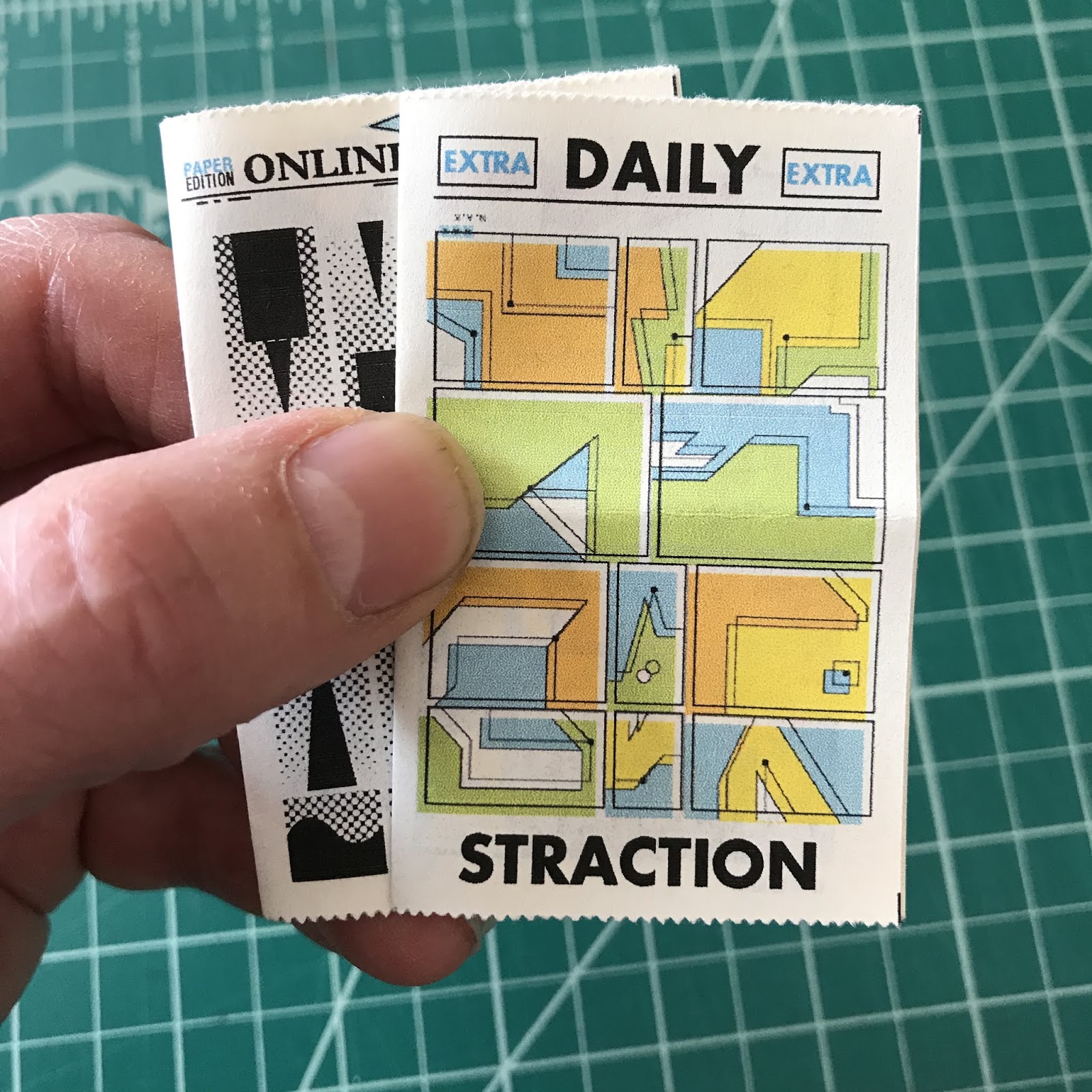
Think all about it!


Needs no words. This fun little newspaper project has 16 pages of absorbing hard hitting  abstract Comics. From the front lines of my drawing desk to your mailbox. Or you can view these comics online by going to Eat-Less Comics, the link in The NAKUNIVERSE on your right.


Thursday, August 15, 2013

SAYSOME more....No.4


New issue of Saysome is out! Available for free at Comic Factory in Winnipeg and a few scattered locations in the Exchange area. If you are out of town, e-mail me (nak@mts.net) your postal address
and I will send you a copy!

8pgs. Mini comic format. Mostly abstract-ed ink drawings/doodles...INklings! A couple Meanwhile...strips, and the continuing visual adventure of Super Secret Abstract Gadget Man.

Thursday, March 3, 2011

Twists & Surreal Turns

Here are a couple newest 'works' I guess you can say. I don't know what I am going to do with the HeyPal one which I thought of only yesterday on the way to the studio. Maybe do a screen print for it or make a magazine-like ad with some copy that I've already come up with or just send it out there.

As with a lot of my ideas, something just clicks in my head. I wouldn't really say that it's like a Light Bulb over my head but rather more like a Thousand Russian Ghosts spinning the world in order to screw in a light bulb inside my head. There is often a surreal twist that goes astray after just seeing something. The ADMIT IT ticket idea was no different. Just working at my desk which just happened to have an Admit One ticket on it (which was probably there for weeks) when suddenly....Bang! I heard the noise of that light bulb crashing on the floor. Maybe I was guilty of something at the time or perhaps it's just a state of mind. Solid state? I think I'm still operating on the old tubes.

These tickets I'm just manufacturing myself in various sizes (the 12 inch ones are pretty cool) with slight design variations. From printing, cutting and perforating, I'm doing it all at the Nakfactorium. I have a 40 inch long strip of three tickets which is pretty enjoyable to see. Each ticket of course has a different number. 


Wednesday, June 16, 2010

AERO EVOLUTION

UPC bar codes began widespread use in the beginning 1980's.

 
52-50-066 This is an Aero Chocolate Bar wrapper from around 1987. This same design had been used since the 1960's with virtually no changes. Aero was originally made by Rowntree (since 1935) but merged with Mackintosh in 1969. The bars were previously 36 grams.


L5-50-115  In 1987 Rowntree Macintosh went public and in 1988 was bought by Nestle with an offering value at 4.55 billion dollars.  We now see the Nestle logo up front on the wrapper. In the following wrappers watch how the logo changes. 
     If you look at the top of the wrapper there is a 7 digit number. The last three numbers seem to change with every slight change in design or alteration of the printed wrapper. I have a Caramilk wrapper where there is a single increment number difference and the only foreseable difference was a switch in the order that a couple of the ingredients appeared in.  So since the time of the wrapper shown above this one, there has been 49 changes to the wrapper. I am only showing a sampling of major changes in the design appearance of the wrapper.
     Oh yeah, the Aero lettering design had finally changed after all those years and Nestle cut a gram of chocolate out.
     Is there a difference between Milk Chocolate and Pure Milk Chocolate?

 
L5-50-129  Here we go with the Bubbles in the phrase Pure Bubbly Milk Chocolate.

  
L5-50-177  The newer Nestle logo and Aero is Big on Bubbles


L5-50-242   I just love how the bubbles have now exploded throughout the design. I absolutely love this one. Why the pause after Big........? Again a new Nestle logo.

L5-50-242  (Why is this number the same as previous wrapper?) There are many changes again. The bubble slogan has changed and the Nestle logo has changed again! This wrapper from March 2010

Huge overhaul of Aero lettering style. (April 2010)I was not a fan at first, but it's growing on me. The number at the top is a whole new ball game. The slogan 'Have you felt the bubbles melt' has been shoved to the sidelines. Will it be totally gone next time around?  


Friday, May 14, 2010

PECHA KUCHA NIGHT


How does it get from here to there?
This Thursday May 20th I will be one of about 20 presenters for Pecha Kucha night Vol.2. Everyone gets 6 minutes and 40 seconds to talk about whatever they want and using no more than 20 slides at 20 seconds each. I will show images of work from my recent show Visual Chew but the main part will illustrating the evolution of the AERO chocolate bar wrapper. COME ONE AND ALL FOR DRINKS AND DISCUSSIONS! 

Tuesday, March 23, 2010

Visual Chomping


The show VISUAL CHEW at Martha St. Studio is a wonderful success. People are really enjoying it. Here is a preview article which appeared in the Winnipeg Free Press. The Opening was very very well attended and people seem to be coming out in numbers during the length of the show.
I hope to post some shots of the opening night soon. In the meantime here are a few shots of what you first see when you come through the doors. Then there is much more!

Thursday, August 28, 2008

Sgt.SMOKES

     My newest novelty item. The butts are real for now untill I can figure out a way to make fake ones. ( but I will always have the 'real action' ones because that was really the whole idea )

      Like most of the novelty items I come up with I really get excited about designing the right kind of package  and making the design fit into a certain era. I had the idea 4 years ago and started to collect butts for it. I was waiting on creating the art because I was waiting to find that classic image I had in my head of the teeth-clenched seargent with the broken dangling cigarette in his lips, but could never find one. So I finally bit the bullet and just drew it myself. I was planning to ink the drawing traditionally, but for the heck of it I tried to see how it would look if I drew out the black inks on the computer in Adobe Illustrator with my mouse.(Its all outline vectors) It happened really fast. The lettering is Dom Casual and the colors kinda instantaneously appeared. I think I captured that cheap toy plastic dollar store (drug store in the old days) look.  I am really happy with how it all came together though I've only been able to make two packages so far as it's hard to find good butts these days.  
Soon available at the NAKFACTORIUM on my website.